Soft blobs of colour melting into one another are the most recognisable background of the past decade: phone wallpapers, operating-system screens, app icons, start-up websites. Vector editors draw this look with a gradient mesh, hence the name. Here the same aesthetic is made mathematically, and it never sinks into a muddy grey patch in the middle.
How it works
“Blobs” places 3 to 16 coloured points on the canvas. To keep them from clumping, their positions come from the R₂ quasi-random sequence, built on the plastic number ρ ≈ 1.3247, a cousin of the golden ratio; their colours are taken from the palette at golden-ratio steps. A pixel’s colour is the average of all the points’ colours with Gaussian weights: the closer the point, the more it counts.
Mixing happens not in RGB but in OKLab, a colour space where equal steps in numbers look equal to the eye. In RGB, blue and yellow meet in dull grey; in OKLab the transition stays clean and even in lightness. As “Softness” goes to zero, the nearest point’s weight swamps the rest and the gradient turns into a Voronoi diagram with blurred seams. “Bend” shifts the coordinates by slow noise so the borders drift organically instead of in circles. “Saturation” scales the chroma; “Contrast” spreads the blobs’ lightness around the mean. In animation each point glides along its own Lissajous figure with whole turns, so the loop closes; tile mode measures distances to the points’ nearest copies. The output is dithered, so smooth ramps never band.
A bit of history
The Gradient Mesh tool arrived in Adobe Illustrator 8 in 1998: a grid is stretched over a shape and every node gets a colour. Mathematically these are patches of the kind Steven Coons devised for computer-aided design in the 1960s, and PDF still calls them Coons patch meshes. For years designers used meshes for photorealistic vector art, until in the 2010s blurred colour fields became a style of their own; in 2024 Apple added MeshGradient to SwiftUI. The OKLab space this layer mixes in was proposed by Björn Ottosson in 2020 and reached CSS within a few years.
What to tweak
- Four to six blobs, “Softness” at 0.85–0.95 and a palette of neighbouring hues (the “analogous” harmony) make a calm phone wallpaper.
- “Softness” at 0.1–0.3 gives soft-seamed colour fields, close to abstract painting.
- “Bend” at 0.6–1 stretches the blobs into flames and waves.
- “Saturation” at 0.6–0.8 is pastel; 1.4 and up is acid.
- Add “Grain” on top for the fashionable grainy gradient; with a 20–30 second loop it is a ready screensaver for “Live” mode.
 Fractal noise
 Domain warping
 Cellular noise
 Topographic map
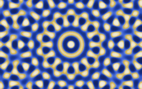 Quasicrystal
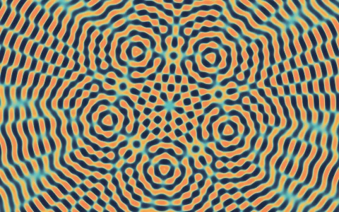 Wave interference
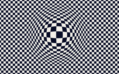 Op art